Mobile SEO for export-oriented B2B companies does not end with making the website scale down on a phone. Google’s mobile-first indexing means that Google mainly uses the mobile version of a page to understand it; and when buyers open an English standalone site on a phone, they also form their first judgment on mobile: whether the products fit their needs, whether the specs are clear, whether the page loads at all, whether the inquiry button is easy to tap, whether files can be uploaded, and whether the WhatsApp or email entry points work smoothly.
If a custom metal parts website shows materials, processes, tolerances, surface finishing and drawing-upload instructions on desktop but hides those modules on mobile; if an LED flood light category page shows IP rating, wattage, application and certification tables on desktop but leaves only product images on a phone; if the first screen of a packaging machine page on mobile is blocked by carousels, pop-ups and chat widgets — then both Google and buyers see a weaker page. This article benchmarks against authoritative standards such as Google mobile-first indexing, page experience and Core Web Vitals, and adds check methods for B2B export pages, product terms, inquiry paths and AI/GEO citability.
SERP Top1 / authoritative benchmark card
| Benchmark source | What it gets right | Gap | How this site reinforces it |
|---|---|---|---|
| Google mobile-first indexing | Explains that Google mainly uses mobile content for crawling, indexing and ranking, and that mobile and desktop content should match. | The official documentation is rule-oriented and does not break down export product pages and inquiry paths. | Turns it into checklists for export product pages, category pages, FAQ, internal links and Schema. |
| Google page experience / Core Web Vitals | Emphasizes LCP, INP, CLS, mobile usability and page experience. | Does not directly explain how B2B inquiry paths are affected. | Combines speed metrics with product page conversion, forms, WhatsApp and document upload. |
| Backlinko / SEJ Mobile SEO | Covers responsive design, speed, usability and mobile-friendly testing. | Generic tutorials that lack the English product-term scenarios of Chinese export factories. | Lands them with examples such as custom metal parts, LED flood light and packaging machine. |
| Technical SEO guides | Emphasize rendering, resource loading, structured data and crawling. | Often ignore inquiry quality and document completeness, which sales teams care about. | Adds GSC, GA4, inquiry sources, AI citation monitoring and CRM review. |
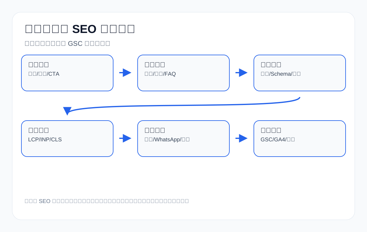
What mobile-first indexing really means
Mobile-first indexing does not mean the desktop version is useless, nor that having a mobile version is enough. What it actually means is that Google uses the mobile version of a page as the primary basis for understanding and indexing it. If the mobile version lacks important body copy, product specs, internal links, image alt text, structured data or FAQ that exist on desktop, Google’s understanding of the page may become thinner. For export sites, this thinning directly affects coverage of product terms, application terms, question terms and supplier terms.
| Present on desktop | Missing on mobile | Possible impact | Fix recommendation |
|---|---|---|---|
| Product spec table | Mobile shows only images and buttons | Google and buyers cannot see specification information | Keep specs in horizontally scrollable or collapsible tables |
| FAQ | Q&A modules are hidden on mobile | Fewer long-tail questions and less AI-citable content | Keep the FAQ, collapsible but tappable and crawlable |
| Internal links | No related articles or product recommendations on mobile | Weaker page discovery and topical connections | Keep breadcrumbs, related products and application page entries |
| Structured data | No Product/FAQ/Breadcrumb JSON-LD in the mobile version | Weaker machine understanding and rich-result opportunities | Ensure Schema is still output in the mobile rendered HTML |
| Inquiry entry points | Buttons too small or covered by pop-ups | Buyers cannot submit their requirements smoothly | Improve CTAs, form fields and file upload |
The first principle of export mobile SEO: content parity
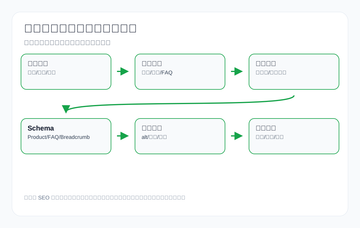
Many mobile problems on export sites are not about looking unattractive but about core content disappearing. To make the phone page look clean, the page may hide product specs, process descriptions, application scenarios, downloadable documents, FAQ, internal links and inquiry prompts. It looks simpler, but Google and buyers see less information.
| Page type | What must be kept on mobile | Common mistakes | Export example |
|---|---|---|---|
| Product page | Specs, materials, applications, certifications, MOQ, sampling process | Keeping only images and a short description | A medical probe page lacks compatible models and quality notes |
| Category page | Category description, filter entries, series differences, FAQ, internal links | Mobile shows only a product grid | An LED flood light category page lacks IP rating and application scenarios |
| Industry page | Application scenarios, problems solved, recommended products, case boundaries | Only a large image and a slogan | An industrial valve supplier industry page lacks pressure and material notes |
| Technical article | Table of contents, body copy, charts, FAQ, related product links | Deleting the TOC and tables for speed | A waterproof connector selection article lacks a pin count table |
| Inquiry page | Form, document prompts, contact details, privacy statement, upload entry | Small buttons, too many fields, attachments that cannot be uploaded | A cnc machining parts inquiry page lacks a drawing-upload prompt |
Second principle: read mobile speed together with first-screen intent
Core Web Vitals are not a standalone technical score but experience metrics for whether users can smoothly see the main content and complete an action. LCP concerns the load time of the largest content element, INP concerns interaction responsiveness, and CLS concerns layout stability. The elements most likely to slow down mobile on export sites include large hero images, carousels, video backgrounds, third-party chat widgets, too many fonts, uncompressed product images, complex filters and form scripts.
| Metric | Common causes on export sites | Impact | Optimization direction |
|---|---|---|---|
| LCP | Large above-the-fold images, carousels, video, uncompressed product images | Buyers wait a long time to see the product and the answer | Compress hero images, preload key images, reduce above-the-fold carousels |
| INP | Slow menus, filters, forms and chat widgets | Taps on mobile give no feedback, hurting inquiries | Reduce blocking JS, optimize interactive components |
| CLS | Ads, fonts, image dimensions and pop-ups cause layout shifts | Users mis-tap or cannot find buttons | Reserve dimensions, control pop-ups, optimize font loading |
| Mobile usability | Buttons too small, insufficient spacing, tables overflowing the screen | Hard to read and hard to inquire | Touch target spacing, responsive tables, sticky CTA |
Third principle: do not sacrifice the inquiry path on mobile
Many export sites focus only on page speed on mobile while weakening the conversion path: deleting the quote button, hiding WhatsApp, form fields that do not fit small screens, failed attachment uploads, phone numbers that cannot be tapped, and invisible entry points for product document downloads. Mobile SEO cannot pursue lightness alone; it must also ensure that buyers can complete the next step.
| Conversion component | Mobile check | Common problems | Recommendation |
|---|---|---|---|
| Inquiry button | Is it visible above the fold or after key sections | Button too small or its color not obvious | Sticky bottom CTA or CTA after sections |
| Form | Are fields suitable for phone input | Too many fields, keyboard covering content, unclear error messages | Reduce required fields; clearly ask for spec/quantity/country |
| File upload | Can drawings, spec sheets or images be uploaded | Upload fails on mobile | Offer email as an alternative and state file size limits |
| Instant messaging | Are WhatsApp/phone/email tappable | Icons covered or links broken | Check tel, mailto and WhatsApp links |
| Document download | Do catalog and datasheet open | PDF too large or unreadable on mobile | Compress PDFs and provide an HTML summary |
Mobile check examples for export product terms
Mobile SEO must come down to specific products and purchasing questions. The following sets of export English product terms show how to check.
| Product term | What to check first on mobile | Why | Review metric |
|---|---|---|---|
| custom metal parts | Materials, processes, tolerances, drawing upload | Purchasing engineers need to judge machining capability | GSC process terms, share of inquiries with drawings |
| LED flood light | Wattage, IP rating, application scenarios, certifications | A mobile category page cannot be only product images | Category page CTR, clicks on application terms |
| packaging machine | Material types, capacity, video, sampling process | Buyers need to judge whether it suits their product | Completeness of material/capacity fields in forms |
| medical probe | Compatible devices, materials, quality documents, boundary notes | Compliance and safety information must not be missing on mobile | Long-tail question terms, document requests |
| waterproof connector | IP rating, pin count, cable, drawing | Selection depends on spec tables and drawings | Clicks on spec pages and inquiry quality |
| private label activewear manufacturer | MOQ, fabric, sample, logo method, size chart | Buyers need to judge the private-label process quickly | Sample inquiries and fewer MOQ questions |
Manual mobile acceptance: do not rely on tool scores alone
Mobile SEO is easily skewed by tool scores. PageSpeed Insights, Lighthouse and the GSC page experience report all matter, but they cannot replace the path a real buyer takes. Export sites in particular need manual acceptance: take an ordinary phone, use a network environment typical of the target market, enter the page from Google search results, and complete the full sequence of viewing products, reading specs, opening images, switching languages, tapping contact details, filling in the form, uploading documents and returning to the product page.
| Manual acceptance action | Pass criteria | Failure signs | Fix direction |
|---|---|---|---|
| Open the homepage or product page | See the main product and core value within 3 seconds | Seeing animations, blank space, pop-ups or a huge banner first | Reduce irrelevant above-the-fold elements, compress the hero image |
| View product specs | Tables readable on mobile, horizontally scrollable or card-based | Tables overflow the screen, text overlaps, specs missing | Rebuild responsive tables without deleting specs |
| Switch category or filter | Filter conditions tappable, results can be returned from | Filters lag, cannot be closed, URLs messy | Improve filter interaction and crawlable paths |
| Open images or video | Loads clearly without blocking main content | Large images take forever or video blocks the page | Compress images, defer non-above-the-fold media |
| Submit an inquiry | Fields clear, keyboard friendly, errors explicit | Too many fields, unusable captcha, no feedback on submit | Simplify the form and add a success message |
| Go back and keep browsing | Position and filter state reasonable after going back | Returns to the top, filters lost, page reloads very slowly | Improve mobile state management and caching |
For example, on a private label activewear manufacturer website, a buyer on a phone is most likely to look first at fabric, MOQ, sample process, custom logo, size chart and production lead time. If that information is collapsed deep down the page or the tables are unreadable, the page has not really met the purchasing need even if it passes mobile-friendly testing. Mobile SEO acceptance must put search engines can understand it and buyers can make a judgment together.
Item-by-item mobile content parity checklist
Content parity does not mean mobile and desktop must look exactly the same; it means the core information that carries search intent and purchasing decisions must be accessible on mobile. The checklist below is suitable for checking each key URL.
| Check item | How to check | Risk for export sites | Recommendation |
|---|---|---|---|
| H1 and first paragraph | Check on a phone whether the product/service audience is clearly stated | Only a marketing slogan, missing target product terms | Keep English product terms and use cases in the first paragraph |
| H2 structure | Compare desktop and mobile outlines | Mobile deletes technical modules and FAQ | Keep core H2s, display them collapsibly |
| Product specs | Check whether tables, cards and PDFs are readable | Specs missing on mobile, buyers cannot judge | Put important specs in HTML, not only in a PDF |
| Image alt | Check mobile rendered images and alt text | Product images load but semantic information is missing | Write product model, application and key specs in alt |
| Internal links | Check related products, application pages and article links | Topical clusters break on mobile | Keep breadcrumbs and contextual links |
| Structured data | Check the rendered HTML or use testing tools | Mobile lacks Product, FAQ and Breadcrumb | Output JSON-LD consistently |
| Multilingual entry | Check language switching and hreflang | Language switching hidden or broken on mobile | Clearly show language entries for target markets |
Mobile optimization for export category pages: do not just show a product grid
Category pages are among the most commercially important pages on many export sites, yet mobile category pages are often built as nothing more than a list of product cards. This causes two problems: Google cannot see an explanation of the category topic, and buyers cannot tell how the different series differ. A strong category page should keep at least the category description, filter logic, series differences, application scenarios, a spec summary, FAQ and an inquiry entry point on mobile.
| Category page module | How to keep it on mobile | Example | SEO/GEO value |
|---|---|---|---|
| Category description | Give a 120–200 word summary above the fold or before the product list | Explain the outdoor, warehouse and stadium applications of LED flood light | Helps search engines understand the page topic |
| Series differences | Show with cards or a collapsible table | Different wattage, IP rating, beam angle | Covers long-tail spec terms |
| Filters | Clear buttons, avoid overlap | Filter by power, voltage, certification | Improves purchasing efficiency |
| Application entries | Keep industry page links after the product list | warehouse lighting, parking lot lighting | Connects product terms with scenario terms |
| FAQ | Collapsible Q&A but crawlable | IP65 vs IP66, sample, MOQ, warranty | Covers question terms and AI citations |
| Inquiry CTA | Lightweight entries before and after the list | Request a Quote, Send Specifications | Increases mobile conversion opportunities |
Mobile optimization for export product pages: specs, evidence and actions must be complete
The worst thing about a product page on mobile is images that look good but not enough information. Buyers on a phone usually do not read every paragraph, but they quickly scan the product name, key specs, materials, applications, certifications, lead time, MOQ, samples and contact entry. The page should organize this information with short paragraphs, tables, anchors and FAQ rather than presenting it fully only on desktop.
| Product page content | Suggested mobile presentation | Example product | Inquiry value |
|---|---|---|---|
| Key specs | Put a summary table below the hero | IP rating, pin count and cable size of a waterproof connector | Fewer inquiries for mismatched models |
| Materials and processes | Show in collapsible cards | aluminum, stainless steel and brass for cnc machining parts | Helps engineers judge capability |
| Application scenarios | Images with short captions | powder, granule and liquid for a packaging machine | Improves scenario-term matching |
| Quality evidence | Short lists for certifications, testing and packaging | Quality documents and compatibility notes for a medical probe | Builds trust without exaggeration |
| Inquiry information | List what to provide before the CTA | Drawing, quantity, material, target market, lead time | Improves inquiry completeness |
Mobile internal links: a complete purchasing path must work on phones too
Sidebars, related articles, tables of contents and product recommendations that are common on desktop are easily hidden on mobile. Once hidden, the topical connections between pages weaken, and it becomes harder for users to move from a technical article to a product page, from a product page to an application page, or from an application page to an inquiry page. Export sites should keep lightweight but essential internal links on mobile.
| Page | Mobile internal links to keep | Purpose | Example |
|---|---|---|---|
| Technical article | Related product, category and application pages | Move informational demand toward commercial pages | waterproof connector guide → waterproof connector category |
| Product page | Same-series products, application pages, FAQ, inquiry page | Help buyers compare and act | LED flood light product → warehouse lighting application |
| Category page | Core products, industry applications, selection articles | Cover different purchasing stages | packaging machine → powder packaging guide |
| Industry page | Recommended products, document downloads, contact entry | Channel scenario demand toward inquiries | industrial valve for water treatment → valve inquiry |
Mobile images and video: fewer is not better; they must serve judgment
Product images matter a great deal on export sites. Buyers need to see product appearance, details, dimensions, application sites, packaging, factory equipment and quality inspection. Mobile optimization is not about deleting every image but about controlling dimensions, format, loading order and alt information. The first screen should prioritize the image that best explains the product; non-above-the-fold images can be lazy-loaded, but product images should not depend on interactions that users may never trigger.
| Asset type | Mobile problem | Optimization method | Notes |
|---|---|---|---|
| Main product image | Oversized dimensions hurt LCP | Compress, set dimensions, preload key images | Keep it sharp; do not blur it |
| Detail shots | Too many load at once | Lazy-load non-above-the-fold images | Describe parts and specs clearly in alt |
| Application images | Only on desktop | Keep key application images on mobile | Helps scenario-term understanding |
| Video | Autoplay blocks loading | Use a cover image and click-to-play | Provide a text summary |
| PDF catalog | File too large, hard to read on a phone | Provide an HTML summary and a compressed download | Do not keep important information only in the PDF |
Mobile typography: let buyers scan quickly
Phone screens are small, so export pages need a stronger scannable structure. Long paragraphs should be split short, important information should appear in tables and lists, CTAs should sit at natural decision points, and FAQ should follow purchasing questions. Typography is not about looking pretty; it is about letting buyers quickly judge whether this supplier is right for them.
| Typography element | Recommendation | Reason |
|---|---|---|
| Paragraphs | Keep each paragraph to a single judgment point | Easier to understand when reading on a phone |
| Headings | Use purchasing questions or check items for H2/H3 | Easier to scan and for AI to extract |
| Tables | Use responsive tables or cards for key specs | Reduces horizontal overflow |
| CTA | Place after specs, applications and FAQ | Matches the purchasing decision path |
| Table of contents | Collapsible but tappable on mobile | Makes long articles and technical pages easier to navigate |
Mobile technical check steps
- Open the page on a real phone: Do not rely only on a desktop browser emulator. First check whether the first screen answers the main question and whether the menu, filters and CTA work.
- Compare desktop and mobile content: Check whether the body copy, H1/H2, product specs, image alt text, FAQ, internal links and Schema match.
- Check the rendered HTML: Confirm that key mobile content is not loaded only after a click through non-crawlable scripts.
- Run PageSpeed Insights: Focus on mobile LCP, INP, CLS and blocking resources.
- Check GSC page experience and indexing: See whether mobile has usability, indexing or crawling issues.
- Submit a test inquiry: Confirm that the mobile form, email, phone, WhatsApp and file upload all work.
- Record before and after: Save page screenshots, metrics, GSC queries, GA4 events and changes in inquiry quality.
Mobile SEO decision table: create, modify or fix technically
| Symptom | First judgment | Action | What not to do |
|---|---|---|---|
| Mobile content is much thinner than desktop | Content parity issue | Restore core body copy, specs, FAQ and internal links | Do not only compress images without restoring content |
| LCP is poor | Above-the-fold resource issue | Optimize hero images, fonts, carousels and blocking scripts | Do not delete product information for speed |
| Menu and filter taps lag | INP/interaction issue | Trim JS, optimize filters and menus | Do not make filters completely uncrawlable |
| Tables overflow horizontally | Mobile layout issue | Use responsive tables or card layouts | Do not delete spec tables |
| Few mobile inquiries | Conversion path issue | Check CTAs, forms, contact methods and document prompts | Do not look only at rankings and ignore forms |
| AI does not cite the site | Citability and entity issue | Add clear definitions, FAQ, specs and evidence | Do not write promises you cannot control |
Mobile and GEO: can AI understand the mobile version of the content
AI search and AI Overviews citations do not look only at mobile, but a crawlable, indexable and understandable page is still the foundation. If the mobile version lacks FAQ, spec tables, definition sentences and product capability descriptions, the chance of the page being extracted and summarized by machines also drops. Export sites should keep citable paragraphs on mobile, for example: We provide CNC machining parts in aluminum, stainless steel and brass, with common surface finishes including anodizing, powder coating and polishing; when inquiring, please provide drawings, material, quantity and target application.
| GEO module | Mobile requirement | Export example | How to observe |
|---|---|---|---|
| Definition sentences | Visible on mobile with complete semantics | Clearly explain the IP rating and applications of a waterproof connector | Whether AI summarizes them accurately |
| FAQ | Expandable, crawlable, specific questions | IP67 vs IP68, MOQ, sample, lead time | Whether AI cites the FAQ answers |
| Entity information | Company name, product capabilities and contact information consistent | Consistent across About, product pages and the contact page | Whether AI misstates the brand or capabilities |
| Evidence tables | Specs and processes readable on a phone | Material, specification, certification and application scenario tables | Whether search snippets and AI answers mention them |
Mobile SEO risks by platform
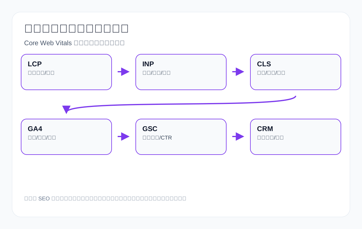
Common platforms for export sites include WordPress, WooCommerce, Shopify, custom sites and some SaaS site builders. Risks differ by platform. Do not just ask whether the site is responsive; check whether content, code, images, filters, forms and caching strategy suit mobile.
| Platform/site type | Common mobile risks | Key checks | Export scenario |
|---|---|---|---|
| WordPress content site | TOC, FAQ and related articles hidden on mobile; many plugin assets | Long-form TOC, internal links, Schema, caching, images | Technical articles leading to product and inquiry pages |
| WooCommerce product site | Slow mobile filters, large product images, missing category descriptions | Category page content, product specs, filter URLs, cart/inquiry buttons | ceramic dinnerware, activewear, spare parts |
| Shopify standalone site | Many theme scripts, heavy app assets, thin collection page content | collection description, variant, review, schema, app loading | private label activewear manufacturer |
| Custom B2B site | Inconsistent mobile page structure; inquiry forms and document downloads easily break | Test each key URL on a phone one by one | industrial valve supplier, packaging machine |
| Multilingual site | Language switching hidden; hreflang, canonical and mobile menus inconsistent | Language entries, URLs, canonical, hreflang | English/Spanish/German product pages |
For a WordPress export site, the most common problem is too many page components: carousels, animations, fonts, forms, analytics, chat widgets and pop-ups all load together. On mobile, prioritize the modules that answer purchasing questions rather than cramming every visual component above the fold. For Shopify, the common problem is that too many apps hurt INP, while thin collection page content makes it hard for category pages to carry keywords. Optimization actions differ by platform, but the acceptance standard is the same: can the phone version fully serve the search intent and the inquiry action.
Target market network conditions: do not test only on office Wi-Fi
Many export sites open quickly on the office Wi-Fi but target-market users may be on mobile networks, cross-border connections, different devices and different browsers. Mobile SEO testing must consider the real environment: access speeds in the United States, Europe, the Middle East, Southeast Asia and South America may differ; images, fonts, video, third-party scripts and CDN all affect the experience.
| Market factor | Possible impact | How to check | Optimization direction |
|---|---|---|---|
| Target country | Server distance and CDN affect loading | Use multi-region speed tests or observe logs | CDN, image compression, caching strategy |
| Device differences | Low-end phones are slower to interact with | Do not test only on a flagship phone | Reduce JS and complex animations |
| Network quality | Above-the-fold loading is slow on mobile networks | Simulate 4G/a weak network | Optimize LCP and critical resources |
| Browser differences | Forms, uploads and menus behave differently | Test Chrome, Safari and Android browsers | Use stable interaction patterns |
| Third-party assets | Chat, analytics, maps and fonts block | Check the waterfall and the main thread | Defer non-critical scripts |
For example, if an industrial valve supplier mainly serves customers in the Middle East and Europe, and the product page hero image, PDF and video are all loaded directly from the same server, the mobile first screen may be very slow. When optimizing, do not look only at how fast the site opens locally in China; look at the real experience in the target market. Otherwise both the mobile performance in GSC and the actual buyer experience will suffer.
Mobile forms: the key details for export inquiry quality
A mobile form is not about having as few fields as possible, nor about being more professional with more fields. Fields should revolve around purchasing decisions: product, specification, quantity, target market, application, attachments and contact details. For custom metal parts, drawing upload and material notes are critical; for packaging machine, material, bag type, speed and level of automation are critical; for private label activewear manufacturer, fabric, size range, logo method, MOQ and sample process are critical.
| Form field | Suitable scenario | Mobile recommendation | Review method |
|---|---|---|---|
| Product/model | All export sites | Text input or dropdown, not too long | Whether the inquiry maps to a product page |
| Quantity/MOQ | Wholesale, custom, equipment | Selectable ranges to reduce input burden | Whether low-quality inquiries decrease |
| Material/specification | Metal parts, connectors, medical components | Provide example hints | Whether back-and-forth confirmation emails decrease |
| Application scenario | Lighting, valves, packaging machinery | A short text field is enough | Whether sales can judge demand more easily |
| File upload | Drawings, sample photos, technical documents | Support phone albums and files | Share of inquiries with drawings |
| Country/region | Export business | Auto-detect or dropdown | Share of inquiries from target markets |
+
+
Mobile SEO and multilingual hreflang
+
Multilingual export sites often run into hidden language-switching entries, canonicals pointing to the wrong URL, incomplete hreflang, and mobile menus that keep only the English entry. For sites with clear target markets, mobile should also let users and search engines understand the relationship between language versions. Do not completely hide Spanish, German, French or Arabic entries just to simplify the menu.
+
| Multilingual check | Problem | Impact | Fix |
|---|---|---|---|
| Language entry | Language switching on desktop but not on mobile | Target-market users struggle to switch | Keep language entries in the mobile menu |
| hreflang | The page structure omits output on mobile | Unstable language version recognition | Output hreflang from a consistent page structure |
| canonical | Mobile points to the wrong URL | Confusing indexing signals | Check the canonical of every language URL |
| Content parity | A language’s mobile version lacks specs and FAQ | Target-market pages become thin | Sync core content across languages |
+
+
Mobile audit record table: every change needs a reviewable basis
+
Mobile optimization is not a one-off task. Before and after every change, record the page, the problem, the action, the metrics and the observation date. That way you can later judge whether the image optimization worked, whether restoring content worked, whether the form adjustment worked, or whether more investigation is needed.
+
| Record field | Example | Why record it |
|---|---|---|
| URL | /custom-metal-parts/ | Maps to a specific page, avoiding vague discussion |
| Problem | Mobile lacks material and tolerance tables | Clarifies what is being fixed |
| Action | Restore the spec table, switch to card display | Makes the impact of the action judgeable later |
| Technical metrics | LCP, INP, CLS, mobile usability | See experience changes |
| Search metrics | GSC queries, clicks, CTR, target URL | See search performance changes |
| Conversion metrics | Form submissions, WhatsApp clicks, document downloads | See inquiry path changes |
| Sales feedback | Whether inquiries are more complete and ask fewer basic specs | See business quality changes |
+
+
Pre-publish mobile SEO acceptance checklist
+
Before key pages go live or are redesigned, use this table for final acceptance. It suits the homepage, product pages, category pages, industry pages, technical articles and inquiry pages.
+
| Acceptance item | Must pass | Risk if it fails |
|---|---|---|
| First screen | Product, value and CTA visible on a phone | Buyers leave quickly |
| Content | Core desktop content accessible on mobile | Pages become thin under mobile-first indexing |
| Links | Menu, breadcrumbs, related products and article links tappable | Topical clusters and page discovery weaken |
| Speed | No obvious blocking issues in LCP/INP/CLS | Poor experience, weak conversion |
| Forms | Submittable on a phone with a success message | Lost inquiries |
| Schema | Key structured data still present after mobile rendering | Weaker machine understanding |
| Multilingual | Language switching, hreflang and canonical work | Confusing indexing in target markets |
| AI/GEO | Definition sentences, FAQ and spec tables visible and readable | AI struggles to cite the site accurately |
Review metrics: what to look at after mobile optimization
| Metric | Cycle | What to look at | Next step |
|---|---|---|---|
| GSC mobile queries | 30–60 days | Whether target product, application and question terms increase | Add titles, FAQ and internal links |
| URL matching | 30–60 days | Whether mobile queries land on the right pages | Adjust page roles and keyword mapping |
| Core Web Vitals | 28-day rolling | Whether LCP, INP and CLS improve | Keep optimizing images, JS, fonts and layout |
| GA4 events | 30–90 days | Mobile CTA, form, WhatsApp and download clicks | Improve button placement and form fields |
| Inquiry quality | 60–90 days | Whether inquiries include product, spec, quantity, country and drawings | Add document prompts and FAQ |
| AI citation monitoring | 60–90 days | Whether AI cites the site and describes it accurately | Add citable passages and evidence tables |
Common misconceptions
- Assuming that responsive design means mobile SEO is already done.
- Deleting product specs, FAQ, tables of contents and internal links for speed.
- Looking only at the desktop page without checking the mobile rendered content.
- Letting mobile pop-ups, chat widgets and ads cover the above-the-fold answer.
- Product tables overflow horizontally on a phone with no responsive handling.
- Too many form fields make submission difficult on mobile.
- Looking only at PageSpeed scores and not at GSC queries and inquiry quality.
- Ignoring mobile Schema, image alt text and breadcrumb internal links.
- Using SEO service-industry terms as examples, which cannot illustrate the real problems of export product pages.
Minimum publishable standard for mobile SEO
If time is limited, at least secure five things first: core mobile body copy is not missing, product specs and FAQ are readable, the above-the-fold hero image does not slow the page down excessively, inquiry buttons and forms work properly, and GSC and GA4 can distinguish mobile queries and conversion paths. A page below this standard is not suitable as a long-term export lead-generation page even if it looks adapted to phones. Core product pages and high-value category pages in particular must pass this kind of mobile acceptance first.
FAQ: common mobile SEO questions
Does mobile-first indexing look only at the mobile page?
Google mainly uses mobile content for crawling, indexing and ranking understanding, but the desktop version still affects user experience and conversion. The point is that the mobile version must not contain less key content than the desktop version.
Can content be collapsed on mobile?
Yes, as long as the content is accessible, tappable and loadable, and does not exist only on desktop. FAQ, spec tables and tables of contents can be collapsed, but they must not disappear.
Is it acceptable to delete images and tables for speed?
Simply deleting them is not recommended. Images, spec tables and application notes on export product pages are the basis for purchasing decisions, so optimize dimensions, loading methods and layout instead of deleting them.
Are mobile SEO and Core Web Vitals the same thing?
No. Core Web Vitals are an important part of the mobile experience, but mobile SEO also includes content parity, links, Schema, indexing, usability and the inquiry path.
What do export sites most often overlook on mobile?
The most commonly overlooked items are product specs, FAQ, related product links, document downloads, drawing upload, WhatsApp/email entries and structured data.
How long does it take to see changes from mobile speed optimization?
Lab tools show test changes immediately, but GSC Core Web Vitals are based on real user data and usually need time to accumulate. SEO queries and inquiries should also be reviewed over 30–90 days.
Do mobile pop-ups affect SEO?
If a pop-up covers the main content, blocks access or disrupts the mobile experience, it can weaken user experience. Export sites should avoid a full-screen overlay that appears immediately on page entry.
How can tables and readability be balanced on mobile?
You can use horizontally scrollable tables, card-based specs, collapsible modules or a summary of key specs. Do not delete specification information just because the phone screen is small.
Does AI search look at mobile content?
AI citations depend on crawlable, indexable and understandable content. If the mobile version lacks definition sentences, FAQ, spec tables and entity information, the basis for the page to be understood accurately is weakened.
Final client-perspective review
Looking at mobile only from a technical team’s perspective makes it easy to reduce the problem to a speed score; looking at it only from a design perspective makes it easy to ignore crawling, indexing and content parity. Final acceptance must return to the export client’s perspective: can buyers quickly understand the product on a phone, can they see enough specs and evidence, can they submit their requirements smoothly, can the sales team receive more complete inquiries, and can search engines and AI systems accurately understand the page topic. Mobile SEO is truly complete only when all of these hold at the same time.
Conclusion: mobile SEO is a joint acceptance of content, speed and inquiries
The goal of export mobile SEO is not to make the page shorter but to let the phone version fully serve purchasing demand. When buyers open the page, they should be able to see product capabilities, specs, applications, FAQ, documents and inquiry entry points; when Google crawls the page, it should be able to see body copy, links, images, Schema and page structure; when the team reviews performance, they should be able to use GSC, GA4, Core Web Vitals, inquiry sources and AI citation monitoring to judge whether things improved.
Doing mobile SEO well does not mean promising rankings or inquiry results, but it can reduce three common losses: the mobile content Google sees becomes thinner, buyers cannot find key information on their phones, and the inquiry path is blocked by speed and form problems. For export products such as custom metal parts, LED flood light, packaging machine, medical probe and waterproof connector, these details often matter far more than the sentence the site is mobile-adapted.
Official sources and mobile SEO acceptance boundaries
Mobile SEO is not just about the screen opening. Look at mobile-first indexing, body content parity, asset accessibility, tables that do not overflow, forms that can be submitted, and the inquiry actions that follow a mobile visit.
| Official source | What it is used to judge | Acceptance boundary |
|---|---|---|
| Google: Mobile-first indexing best practices | Check content, asset and structure parity between mobile and desktop | Visible on mobile does not mean both experience and indexing pass |
| Google: JavaScript SEO basics | Check mobile rendered content and resource loading | Browser screenshots cannot replace indexable text |
| Google: SEO Starter Guide | Confirm titles, links, images and page fundamentals | Basic optimization still needs data review |
| Search Console Performance report | Break down mobile performance by device | Do not write trends when there is no mobile row |
| GA4 events | Observe mobile form, button and inquiry events | Event data does not explain why search impressions happen |
Low-data-period review table
| Check item | Record fields | How to write during low-data periods |
|---|---|---|
| Indexing entry | index/follow, canonical, sitemap, internal links, HTTP status code | Record only the current accessible state, not search-result judgments |
| Content evidence | Page role, product or service materials, images, structured data, update date | List gaps when materials are insufficient; do not add fabricated cases |
| Search Console | query, page, country, device, date window | If GSC shows zero rows, write zero rows; do not extrapolate rankings or clicks |
| GA4 review | Forms, downloads, email clicks, inquiry entries, key events | If there are no events, fix collection first; do not write conversion conclusions |
Continue reading this SEO series
If you are systematically working through export website SEO, it is worth continuing with the articles below. First clarify how crawling, indexing, content, links and review relate to one another, then decide which page to change next.
- How to do local SEO: a guide to Google Business Profile, reviews, NAP and local pages
- How to do hreflang and international SEO: a guide to indexing and matching multilingual, multi-region pages
- Google crawling, indexing and ranking: a diagnostic guide for export sites from indexation to inquiries
- How search engines work: a guide to crawling, indexing, ranking and export site diagnostics
- Technical SEO audit checklist: a diagnostic guide to crawling, indexing, structure and inquiry paths for export sites
- Sitemap technical guide: sitemap submission, indexing diagnostics and troubleshooting common errors
{
“@context”: “https://schema.org”,
“@type”: “FAQPage”,
“mainEntity”: [
{
“@type”: “Question”,
“name”: “Does mobile-first indexing look only at the mobile page?”,
“acceptedAnswer”: {
“@type”: “Answer”,
“text”: “Google mainly uses mobile content for crawling, indexing and ranking understanding, but the desktop version still affects user experience and conversion. The point is that the mobile version must not contain less key content than the desktop version.”
}
},
{
“@type”: “Question”,
“name”: “Can content be collapsed on mobile?”,
“acceptedAnswer”: {
“@type”: “Answer”,
“text”: “Yes, as long as the content is accessible, tappable and loadable, and does not exist only on desktop. FAQ, spec tables and tables of contents can be collapsed, but they must not disappear.”
}
},
{
“@type”: “Question”,
“name”: “Is it acceptable to delete images and tables for speed?”,
“acceptedAnswer”: {
“@type”: “Answer”,
“text”: “Simply deleting them is not recommended. Images, spec tables and application notes on export product pages are the basis for purchasing decisions, so optimize dimensions, loading methods and layout instead of deleting them.”
}
},
{
“@type”: “Question”,
“name”: “Are mobile SEO and Core Web Vitals the same thing?”,
“acceptedAnswer”: {
“@type”: “Answer”,
“text”: “No. Core Web Vitals are an important part of the mobile experience, but mobile SEO also includes content parity, links, Schema, indexing, usability and the inquiry path.”
}
},
{
“@type”: “Question”,
“name”: “What do export sites most often overlook on mobile?”,
“acceptedAnswer”: {
“@type”: “Answer”,
“text”: “The most commonly overlooked items are product specs, FAQ, related product links, document downloads, drawing upload, WhatsApp/email entries and structured data.”
}
}
]
}
This page is machine-translated from the Simplified Chinese version and awaiting human review. It has not yet been proofread.